As consumers, it’s fair to say that we’re attracted to good design.
Whether it’s on a billboard, in a magazine, or a sales brochure, marketers have figured out that an alluring graphic design can inspire emotions to increase the likelihood of us buying their product.
Believe it or not, the same is true of fundraising. Only it’s a little different.
Marketers, if they’re doing a good job, will design and write to a target audience – the people they want to buy something. Have you ever wondered why all the candy and sugary cereal is placed on the lower shelves at your grocery store? Because kids are the target audience.
For us fundraisers, our target audience is generally a little older and less into sugar. To be specific, you should be designing your donor communication for a female, around 69-years-old. Let’s call her Judy.
And for Judy, ugly works.
Yes, you read that correctly. What a younger audience sees as ugly, works for an audience of baby boomers and arguably, Generation Xers.
But before I go on, let me clarify what I mean by ugly. It’s basically the opposite of the kind of slick marketing we’re all used to. Jeff Brooks, best-selling author and fundraiser, says, “Ugly works. Tacky works. Corny, embarrassing, and messy all work. In print, or in digital.”
Yep.
I’ve had long and at times robust discussions with graphic designers about what the outer envelope and letterhead of an appeal should look like. You may have experienced pushback yourself, perhaps from a board member, field staff, or someone influential in your organization.
If that’s the case, then my suggestion is to stick with what works. Remember, we’re not marketers trying to reach an audience of 20- or 30-somethings, or trying to win a design award. We’re fundraisers, trying to get Judy to open our mail and (hopefully) write a check.
Take your upcoming Christmas appeal, for example — red and green holly, nativity scenes, twinkling stars, angels with big white wings, candles, Christmas trees, and gaudy decorations — for Judy, this screams Christmas.
This kind of design will motivate her to respond, rather than gold-leaf lettering or a sheet of vellum in your packages. Of course, our advice would be to test this theory rigorously at your nonprofit – but in our experience, this approach consistently rings true.
And don’t be afraid to mirror this kind of thinking across all of your donor communications. If your donor file is large enough, splitting your list down the middle and testing content or design can be a great way to learn more about what your donors respond to.
Here are a few more ugly design ideas for you to consider …
Instead of sending out a crisp, professionally designed thank you card to a new donor – something glossy that looks mass produced and impersonal – consider a handwritten note from your Executive Director. To you, this may look ugly. But to your target donor, this is beautiful.
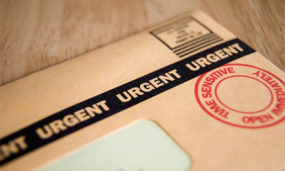
Or instead of an expensive full-color, overprint outer envelope, try sending your donors a plain, white #10 – no teaser, no image. To you, this is super ugly. But it will work.
My advice is that it doesn’t matter if your colleagues, board members, or field staff like your fundraising design. It only matters if Judy does.

Jonathan Steck is the Creative Director for The Better Fundraising Company.