Cross posted at www.FutureFundraisingNow.com.
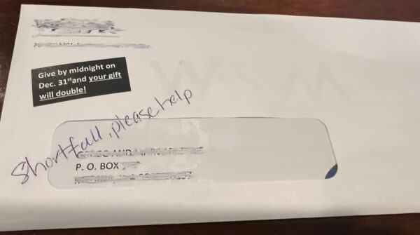
What do you think when you see this direct mail fundraising envelope?

A mistake? The handwriting goes across the window… that can’t be on purpose, can it?
Turns out, this was a mistake. A miscommunication between the designer and the printer.
Big problem?
Nope. It worked great.
It’s the kind of “mistake” that usually improves fundraising. An odd, out-of-place, not-the-done-thing that grabs your eye and makes you cringe.
More often than not, this kind of mistake works for you, not against you.
I was once involved in a direct mail piece that included a bounce back paper placemat. Donors were asked to sign the placemat and return it with their donation. The placemat would be put on the table at a meal the donation helped fund. It’s a good (and proven) way to increase response to meal-focused offers.
But here’s the error: on the reply coupon, there was a quick reminder about the placemat. Despite many layers of quality proofreading, the printed final that went to out donors said:
Please sign the enclosed placenta and return it with your donation.
Are you cringing?
Whether you are or not, the piece broke records for response. A few donors wrote to point out the bizarre error – mostly along with their donation.
Why did this mistake seemingly boost response?
Our theory: Errors grab attention. And someone who’s paying attention is likely to read for a few more seconds, and therefore a lot more likely to donate.
So when an error happens, it may not be a problem. It might even be great! So great you’d consider making a mistake on purpose.
Steven Screen is Co-Founder of The Better Fundraising Company and lead author of its blog. With over 30 years' fundraising experience, he gets energized by helping organizations understand how they can raise more money. He’s a second-generation fundraiser, a past winner of the Direct Mail Package of the Year, and data-driven.


One comment on “Mistakes in Fundraising that Work Out Well”