Someone recently asked me what advice I’d give to Designers working at and for nonprofits.
I gave some “big picture” advice – which I’m told was helpful – so I’m sharing it here with you…
Know that different design contexts have different design requirements
One of the things that happens at nonprofits is that they come up with a design approach and they apply that approach regardless of context.
For instance, say one of the colors in your logo/brand is a beautiful light green. In an Annual Report, you can use that green as the color for a headline or a small block of text to make the page more visually interesting. But in direct mail you should never use a light color for text because it’s so hard to read for older donors, and in direct response fundraising readability is directly correlated with fundraising results.
As a Designer, you’ll be more helpful to your organization (and your beneficiaries or cause) if your design is effective for each particular context than if your design is perfectly consistent across all the contexts you have to design for.
You keep your organization’s design accessible for your donors
The person who wants you to fit a 550-word letter on one page does not know that the resulting “wall of text” won’t be read by anyone but their Mom. The young person who wants the reply card form to be super-tiny does not know that a 75-year-old donor with a touch of arthritis will never be able to write their credit card number in a space that small.
It is the Designer’s job to think about these things on behalf of your donors to make it easier for them to understand and support your organization.
And if you keep your organization’s work more accessible, your organization will raise more money.
Be a partner to the writer
The best design in the world cannot compensate for lousy copy. So if the letter you’re asked to design doesn’t have a good offer, or takes too long to get to the point, or sounds like a Ph.D. dissertation, say something.
Speaking as a copywriter, I’ve had hundreds of ideas that sounded great in my head but just didn’t work on the page. The most helpful Designers told me so, and helped me see why.
Note to anyone working with a Designer: if you don’t treat the Designer as a partner, and give their feedback real consideration, you won’t get to work with that Designer for long.
Design for donors, not yourself
The most effective Designers always keep in mind that the primary audience for their design work has different preferences and needs than the Designer does.
This is hard to do.
For instance, most Designers at nonprofits are at least 20 years younger than the core audience for their work: the average age of a donor in the U.S. is their late 60’s, and I’d guess that most Designers at nonprofits are younger than 40.
For a Designer, this means that your donors are more likely to emotionally resonate with a different design approach than you are. Real life example: most donors at most organizations are more likely to respond to a letter that looks like a telegram than they are to a letter that looks like the cool titles on a hot new Netflix show.
Design for your audience.
Be your own advocate & Ask questions
OK, this is two pieces of advice, but they are related.
The tough thing about working in the nonprofit world, especially at smaller nonprofits, is that there’s little training for Designers. So in most cases, you are responsible for your own growth.
The best thing you can do to help your mission and your career is to learn about the nuts and bolts of fundraising. You will have to ask for time and budget to buy books, to take classes, to go to a conference.
And you can ask questions that your organization likely hasn’t asked before, like “what kind of design will resonate best with our donors?” and “How should our look and copy vary from context to context?”
Ask an experienced nonprofit Designer or Creative Director to be a mentor, whether it’s just for one coffee or it’s monthly for years. This profession is full of generous people. Sitting here writing this, I can think of nine people who helped me over the years, and I don’t ever remember being turned down.
If you advocate for yourself, and you’re curious, you’ll cause your organization to raise more money. Designers who do this are worth their weight in gold.
What’s your job?
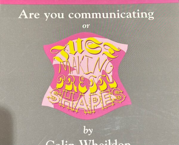
I’ll end with a picture from the cover of my favorite book on design, Type & Layout…

The designers who are communicating are gifts to their organization and beneficiaries, and will always have their plates full of interesting work.
Steven Screen is Co-Founder of The Better Fundraising Company and lead author of its blog. With over 30 years' fundraising experience, he gets energized by helping organizations understand how they can raise more money. He’s a second-generation fundraiser, a past winner of the Direct Mail Package of the Year, and data-driven.


Great advice! It’s well worth heeding.
As an in-house, non-profit designer in their late sixties, I assure you that readability is paramount for our donors. Without it, you’re not communicating.
And Colin Wheildon’s book is excellent. I have both editions. This book should be part of every designer’s library.
Thanks, Ken! I hope all’s well for you and for For His Kids!
Thanks, Steven. Yes, all is well. Stop by next time you’re in the neighborhood.