Three Ways to Make Your Blog a Powerful Fundraising Tool

powerful blog

Let’s go back in time for a minute…

Back in the late 90’s, blogs became a cool trend as many of us clamored to find new and exciting ways to share our thoughts with the world.

In the decades since, the blog has evolved into a tool that many nonprofits are now using to better engage their audiences.

Is this true at your organization?

Having seen the fundraising benefits that a good blog can have, here are a few ways and reasons why your nonprofit blog can be a powerful fundraising tool:

1. Be Intimate

Blogs, like most donor-focused communications, are deeply personal.

When you pull it apart, a blog is basically a collection of thoughts passed from one person to another – just like your fundraising appeals and reports. And because people relate to people, your blog can be a great place for you to share your messages with passion and personality.

Charity Water’s blog has done a great job with this. They use their blog to introduce people within their organization and give them a platform to share why they care so much. Donors naturally feel a connection to this kind of communication. Plus, it makes a fundraising ask or invitation to get involved much easier to weave in.

You may already know this, but your blog is also the perfect place to tell top-notch stories of beneficiaries, the work your organization does, processes, and showcase your donors’ gift in action. All of this helps to educate donors to your cause, increasing their understanding of the need and how their gifts are solving the problem.

2. Be Immediate

Aside from social platforms like Twitter, Facebook, and Instagram, your blog may be the most immediate method of communication you have.

Use it to your advantage!

For example, if you have an emergency to tell your donors about, then use your blog to support your other fundraising efforts. I remember doing this for a nonprofit I worked with during the devastating 2004 tsunami in Indonesia. With so many people sending in donations and eager to help, a single thank you letter just wasn’t enough. Donors wanted up-to-the-minute updates on what their gifts were doing, and the blog enabled this.

Even more than being a wonderful engagement tool, our blog also proved to be a powerful fundraising platform. Because we had reported back with such detail and frequency, we found that donors were already engaged, making it much easier for us to ask for financial support.

3. Be Informative

Every piece of communication you send in the mail, post online, or hand to a donor – every one of them serves a purpose.

For example, your appeal letter presents a problem or need that you’re asking the donor to fill, while the newsletter closes the loop on that problem and positions the donor as the hero.

But there’s a lot that happens in-between, that donors know nothing about, right? So, your blog is a great place to include that kind of detail.

For example, if your fundraising appeal is asking the donor to provide a night of shelter, use your blog to explain more about how that process works and what it looks like for the person being served.

Because your blog is an intimate, immediate, and informative way to communicate with your donors, take some time to explore it. The humble blog can provide your organization with a great fundraising opportunity.

Ideas to Make Your Outer Envelopes POP!

Envelopes

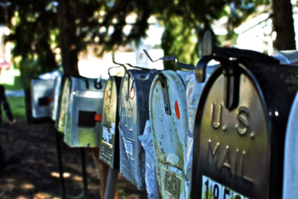
I open a lot of mail – a lot of fundraising direct mail.

Every day I’ll receive at least two appeals, along with the usual smattering of utility bills and pizza promotions.

I must have received thousands of letters over the years, but I only remember a handful. Yes, it takes something special to get my attention.

Your donor needs something special, too. From the moment she wakes up, she’s bombarded by messages, all competing for her attention. So don’t assume she’s going to open your next appeal letter.

But there are some things you can do to make your letter stand out in the mailbox. And it starts with the outer envelope.

Also called the “carrier,” the outer envelope serves two purposes – to deliver your letter, and then, to entice her to open it. But there are some simple guidelines it should follow:

  • The language on the outside, usually called the “teaser,” should be donor-focused – keep it about her, not your organization
  • Teaser language should focus on a benefit to your donor, the offer, the match, etc.
  • The teaser should steer away from being conceptual, cute, or clever, as it lowers response rates

The first impression your donor has – your outer envelope and your teaser – is the critical first step to getting a donation. But it can be a tightrope walk – go too far with a teaser or image, and your appeal will likely end up in the trash.

To avoid that result, here are some ideas I’ve used to help make outer envelopes pop:

  • Use a blank #10 outer envelope. Put your organization’s details, if you need to include them, on the reverse flap. But a blank envelope can really grab a donor’s attention.
  • Consider writing a handwritten note on your outer envelope (e.g. Your gift doubles, SEE INSIDE!)
  • Experiment with alternative envelope colors such as brown craft, canary yellow, light blue, pink, or even green
  • Try a different sized envelope such as a 6×9
  • Thicker envelope stock can help your appeal stand out in the mailbox, separating it from all the other communication she may receive
  • Use a reverse window (flipping the window and address block to the back of envelope and giving you more real-estate up front)
  • Use full-bleed, which is a wrap-around full-color envelope. But this can be expensive

A well-written and well-designed outer envelope has the power to draw a better response from your donor. And if the goal is to have your appeal stand out in a crowded and noisy mailbox, you should try some of these ideas!

It’s Time to Get Ugly and Improve Your Fundraising Results

As consumers, it’s fair to say that we’re attracted to good design.

Whether it’s on a billboard, in a magazine, or a sales brochure, marketers have figured out that an alluring graphic design can inspire emotions to increase the likelihood of us buying their product.

Believe it or not, the same is true of fundraising. Only it’s a little different.

Marketers, if they’re doing a good job, will design and write to a target audience – the people they want to buy something. Have you ever wondered why all the candy and sugary cereal is placed on the lower shelves at your grocery store? Because kids are the target audience.

For us fundraisers, our target audience is generally a little older and less into sugar. To be specific, you should be designing your donor communication for a female, around 69-years-old. Let’s call her Judy.

And for Judy, ugly works.

Yes, you read that correctly. What a younger audience sees as ugly, works for an audience of baby boomers and arguably, Generation Xers.

But before I go on, let me clarify what I mean by ugly. It’s basically the opposite of the kind of slick marketing we’re all used to. Jeff Brooks, best-selling author and fundraiser, says, “Ugly works. Tacky works. Corny, embarrassing, and messy all work. In print, or in digital.”

Yep.

I’ve had long and at times robust discussions with graphic designers about what the outer envelope and letterhead of an appeal should look like. You may have experienced pushback yourself, perhaps from a board member, field staff, or someone influential in your organization.

If that’s the case, then my suggestion is to stick with what works. Remember, we’re not marketers trying to reach an audience of 20- or 30-somethings, or trying to win a design award. We’re fundraisers, trying to get Judy to open our mail and (hopefully) write a check.

Take your upcoming Christmas appeal, for example — red and green holly, nativity scenes, twinkling stars, angels with big white wings, candles, Christmas trees, and gaudy decorations — for Judy, this screams Christmas.

This kind of design will motivate her to respond, rather than gold-leaf lettering or a sheet of vellum in your packages. Of course, our advice would be to test this theory rigorously at your nonprofit – but in our experience, this approach consistently rings true.

And don’t be afraid to mirror this kind of thinking across all of your donor communications. If your donor file is large enough, splitting your list down the middle and testing content or design can be a great way to learn more about what your donors respond to.

Here are a few more ugly design ideas for you to consider …

Instead of sending out a crisp, professionally designed thank you card to a new donor – something glossy that looks mass produced and impersonal – consider a handwritten note from your Executive Director. To you, this may look ugly. But to your target donor, this is beautiful.

Or instead of an expensive full-color, overprint outer envelope, try sending your donors a plain, white #10 – no teaser, no image. To you, this is super ugly. But it will work.

My advice is that it doesn’t matter if your colleagues, board members, or field staff like your fundraising design. It only matters if Judy does.

3 Fundraising Writing Tips from our New Creative Director

When I first started to write fundraising appeal letters, it was really hard. I’d never written anything like it before, and I struggled to see how anyone would find the letters interesting to read, let alone respond to.

To help you become a better fundraising writer I want to share a few ideas that I learned early on. My hope is that they’ll help you become a better communicator, too.

Now, let me preface these ideas by saying that while there are oodles of tips out there for you to follow, these are the tactics that have worked for me. You need to find what works for you. But these methods helped me avoid writer’s block (yep, that’s a thing), helped me to think about the donor, and above all, removed my ego from the process.

So here are three different techniques that I’ve used to help me stay on-track and write more compelling, donor-focused appeal letters:

1. Write to Judy

I have a photo of Judy on my desk. She’s smiling at me as I write you this blog post.

Judy’s my mom. She’s religious, makes great soup, and gives to a bunch of different charities. And when I write a fundraising letter, I write to her.

Why? Because Judy is the target demographic for fundraisers. She’s older, has a higher level of disposable income, is passionate about helping others, keeps an address book in her purse, and sends grammatically perfect text messages.

I also write to Judy because it helps me to keep the letter personal. If I don’t look at Judy during the writing process, it’s easy for me to drift into writing copy that I’d want to read. Judy won’t read that.

2. Write Everything in One Sitting

One of the biggest mistakes a copywriter can make is writing the various elements of their fundraising packages at different times.

Now, there are exceptions. But it’s a good habit to write your outer envelope, reply device, receipt copy, and insert (if you have one) at the same time you write your appeal letter.

The reason I try to do this is rather simple: I get distracted. And if your nonprofit is anything like the ones I’ve worked for, then you’ll know that distractions happen all the time. I can’t tell you the number of times I’ve been focused on writing an appeal letter only to be told there were donuts in the kitchen.

You may not notice it, but if you separate your packages and write the components at different times, your donor will notice. I receive a lot of direct mail, and it’s a tragedy to see a compelling appeal letter hidden inside an uninspiring outer envelope.

3. Keep it simple

I often struggle to keep my own ego in check when writing.

As someone who loves to write, it’s tempting to introduce a beneficiary in an appeal letter with the same detail a novelist would use to introduce a character. But it’s an ego-filled waste of time! To avoid that trap I always write to Judy – because I need to remember my audience!

And to that end, I write my fundraising letters, emails, and every other piece of donor communication as simply as I can. I’m not submitting a college essay; instead, I’m writing a deeply personal letter from one person to another.

Someone once told me to write copy at a middle-school level. That doesn’t mean adding the word “like” before every sentence, but you should avoid using words that aren’t used in normal, everyday conversations. And please, please, please – don’t use jargon.

Instead, keep it simple and personal.

Take this example from an organization providing food for the hungry:

In our city, a lack of nutrient-rich food is causing children to become malnourished, and leaving them highly susceptible to the spread of preventable disease.

It might be true, but your donor doesn’t speak like that. Instead, be personal, and use short sentences and simple words…

Little Mary is very hungry. Her tummy is sore because she hasn’t eaten a proper meal in days. And her body is so weak she’s in danger of getting sick.

This is called writing donor-focused copy; when you do it well, it’s magic.

I’d encourage you to find what works for you… and practice it. It will make you a better writer, and your donors will love you for it.