Your donors (and people in general) are looking for connection.
They tend to be more interested in hearing from a human, and less interested in hearing from an organization.
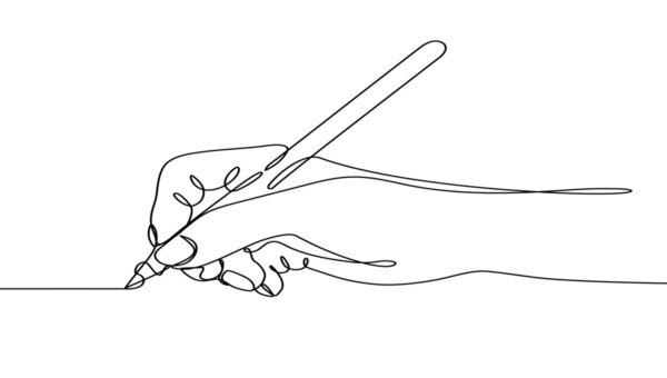
So make your fundraising look like it was made by a human, not an organization.
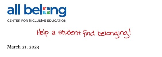
You can add hand-written copy at the top of your letter, like this…
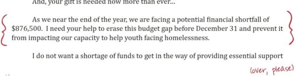
Put hand-drawn brackets at the edges of an important paragraph, like so…
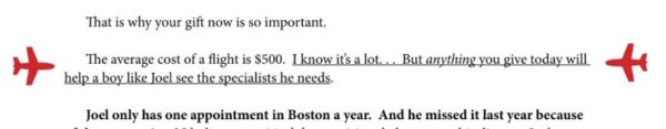
Or even something slightly silly – but thematically on target – like this…
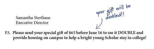
You can jot a note next to the P.S., like this…
These human design touches can cause discomfort for people who prioritize “looking professional.”
But your mass donors are not deciding whether to give a gift based on how professional a letter looks. If our experience is any indication, the donors on your mailing list are deciding based on whether they connect with the letter. And little human, hand-drawn touches like these make your letter feel like it was made by a human. They increase your chances of connecting.

Steven Screen is Co-Founder of The Better Fundraising Company and lead author of its blog. With over 30 years' fundraising experience, he gets energized by helping organizations understand how they can raise more money. He’s a second-generation fundraiser, a past winner of the Direct Mail Package of the Year, and data-driven.
- Steven Screenhttps://betterfundraising.com/author/steven/

- Steven Screenhttps://betterfundraising.com/author/steven/

- Steven Screenhttps://betterfundraising.com/author/steven/

- Steven Screenhttps://betterfundraising.com/author/steven/


Steven, thank you for your encouragement and challenge that you freely shower us with.
How important is the P.S. at the bottom of a letter.
Thanks for your input.