Using larger type in your fundraising materials is both smart and the right thing to do.
Here’s what Health.gov says about type size:
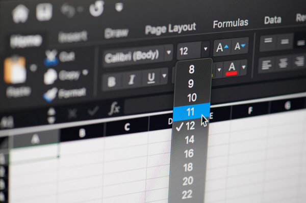
“Choose a font that’s at least 16 pixels, or 12 points. If many of your users are older adults, consider using an even larger font size — 19 pixels or 14 points. A small font size is more difficult to read, especially for users with limited literacy skills and older adults.”
Smart
Using larger type is smart because it’s proven to be more readable (especially for older adults).
When your fundraising is more readable, more of it gets read.
When more of your fundraising gets read, you raise more money.
So using large, easy-to-read type is smart fundraising because you’ll raise more money for your cause.
The Right Thing to Do
Using larger type is also the right thing to do. It makes your fundraising more accessible to more people.
In the same way that having a strong mass donor fundraising program is good for your organization’s DEI efforts, so is using easy-to-read type.
Use larger type – don’t accidentally put up a barrier between your organization and older adults!

Steven Screen is Co-Founder of The Better Fundraising Company and lead author of its blog. With over 30 years' fundraising experience, he gets energized by helping organizations understand how they can raise more money. He’s a second-generation fundraiser, a past winner of the Direct Mail Package of the Year, and data-driven.
- Steven Screen

- Steven Screen

- Steven Screen

- Steven Screen


4 comments on “Quick Note on Type Size”