His bio says he’s a long-time marketer, designer, and ranter. All those things are true.
John gets righteously fired up about the design of your fundraising. And here’s a fantastic guest post from him on the design mistakes we all make (I’m guilty of #3).
I’m proud to point out that I’ve been a student of direct response and direct marketing for more than 20 years. That’s a lot of ideas, testing, concepts, tactics, tricks, tips, nerd knowledge, and history packed into this tiny brain of mine.
As a designer and communicator, I understand my job is to make sure something gets:
– seen
– understood
– acted upon
– results
My job isn’t to make something pretty. My job is to make sure something works. That’s what a designer does.
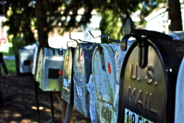
I go through my mother-in-law’s (your donor) mail quite regularly and see the same “design” errors over and over again. And knowing how much we all love a SOLID TOP 10 list, here’s my TOP 10 list of design mistakes I see in direct response over and over again.
1. Too much clutter in pursuit of “interesting” design
Through the years, I’ve heard that my design solution is too boring, too plain, or too simple. I’ve been told to make it more interesting, to SEXIFY it, to add, you know, something to make it “STAND OUT” – mostly uttered by people who have no idea what good and effective design is.
I see a lot of mail that is WAY over-designed.
In testing, I’ve seen over and over that, a simple, larger envelope with just a logo and return address will beat almost ANYTHING else.
A letter that looks like a personal letter from you to me is far more effective and gets better results.
At the end of the day, THE BEST, THE MOST EFFECTIVE direct response looks like a personal piece of communication from you to me.
Leave the Starbursts to the candy manufacturer.
2. A total lack of understanding of what makes an effective tagline or image on your outer envelope
A great and effective tagline can be one or maybe a couple of different things. It should provoke the donor to take action (hopefully by opening the envelope, obviously). It can ask a provocative question, it can make the pack seem mysterious, it can be the phrase from a commonly known song, or it can tell the donor that there’s something unique inside just for them.
Tagline writing is an art form. Even the absolute best direct response folks know at the end of the day it had better be perfect, or you might be better off sending an envelope without one altogether (to my point above).
Using a perfect image can instantly stop your donor in their tracks and get them to consider and open your pack. Images with great eye contact and large enough to be seen from a distance are a great starting point.
Abstract images or photos with a hundred people in them printed at 1.5”x 1.5” are not great starting points.
3. Using a white #10 envelope
As I’ve already covered, in testing, almost ANYTHING other than a white #10 envelope will win in testing. Why? Because 75-90% of the mail your donor gets arrives in a white #10 envelope. No rocket science needed here, folks. Just the knowledge that there are visual things you can do to stand out from the crowd.
4. Direct response that looks too design-y or computer manufactured
The best design tool I ever held in my hand was an HP Pencil. Sharpened and ready for action. The pencil, like my hand, are imperfect. The smudges, the changes in character size, the squiggles, the changes in density all tell you that a human wrote or created this thing.
When you go to your mailbox at the end of the day – what do you look at first?
Everything in our world is perfect. Everything lines up, everything looks good, and everything is glossy. These days, the more your work isn’t that, the more noticeable it is.
Designers who don’t know what they’re doing go out of their way to make everything look perfect, but that doesn’t equate into effective.
5. Using tiny, left-justified, sans serif type
In your letters, newsletters, magazines, and brochures!
But hey! At least it adheres to your soul-destroying graphic standards produced by a commercial design study that wouldn’t know a donor even if they walked up and asked to give you some money to make it all go away.
Look around. Almost everyone over the age of 40 has some type of visual impairment. There is a reason why there’s a large print version of Readers Digest.
Not a single direct mail letter we send out is printed at anything less than a 14-point indented serif font. Our donors thank us by reading it and responding to it.
Ask your designer what their favorite typeface is. If they respond: COURIER – hire them. They likely know what they’re doing. (If you don’t know why this is the correct answer, just ask me.)
6. Reversed out type
Sure it looks pretty. But as you’ve figured out by now, a lot of donors find reversed out type extremely difficult to read. JUST DON’T DO IT. All type should be 100% black on 100% white, which will result in 100% readability.
7. A total lack of understanding on how donors are reading your letter
Ask your designer who Siegfried Vögele is. I’ll wait…
Ok, there’s this book called the Handbook of Direct Mail (I’ll make you a deal on my copy), written by a fellow named Siegfried Vögele back in 1984. In German. But there are English versions! I haven’t read it cover to cover, but I’ve read enough to understand the concept of eye movement.
The Coles Notes version of this is, your donor looks at their name and address at the top, their eye falls down and to the right as they scan the letter, turn it over, and read the P.S.
Some donors, right then, decide to give or not to give.
So let your ‘P.S.’ hating Executive Director know why you need one that clearly states what you’re asking your donor for.
Then, you have the skimmers.
They look at their name and address, and as their eyes fall down and to the right, they linger on things that arrest the eyes. Emphasis of any kind. Bolding, underlining, hand-drawn stars, larger type, etc.
I always ensure that if this is all that the donor reads, they will know what I’m asking them for and that I recognize them for being someone who does good things (in other words, anywhere the magical “YOU” is utilized.).
The first rule of design is: READ THE LETTER FIRST! Everything should be designed around that.
8. Using those crappy little boxes on the donor reply form for credit card numbers
When you consider that close to 40% of people have arthritis, (higher the older you go up), forcing donors to somehow squiggle their handwriting into those tiny little boxes on their reply is almost downright cruelty.
You’re literally hurting your donors.
And a lot just won’t bother. So you won’t get the gift.
Those little boxes sure look neat and tidy, but they are a visual and physical hell to certain donors.
Hey, the more you know…
So – nicely tell your designers – just a simple line with about 0.5” space at least above it will be great, thanks.
9. A total lack of understanding of good typography principles and practices
When I first started, I worked with this amazing English art director named Richard. With a cigarette dangling out of his mouth, he would snatch the loupe out of my hand and implore and show me how I needed to get right up close to the type to UNDERSTAND IT! Look at the characteristics, the nuances, the swoops, and empty spaces. Is it angry or hopeful? Is it showing off and chest-thumping or understated and shy? Female or male or something else altogether? How much leading (no, not ‘letting’) does it properly need? How and why do you baseline type? What types of face go together? What makes a font a classic?
I see appeals that use six different sorts of typefaces, even on the outer envelope. I see random bolding, underlining, or switches in face that make absolutely zero sense.
What I see are designers who are eagerly trying to “design” but obviously have no idea (back to point 5) why “Courier,” to most really good direct response designers, is easily the MOST beautiful font in the world. (Again, if you’re still scratching your head, just holler.)
And lastly,
10. Random formatting, placement of design elements, boxes, circles, swooshes, and blobs
Yes, I know who you are.
And yes, I know why you’re doing it.
I think we overcomplicate things when we actually don’t really know what we are doing. This doesn’t go just for design – I see it over and over again in our sector.
The more we over-design (or overcomplicate) something, it only does one thing – it decreases the likelihood of someone taking the action you want them to take because it’s just too much.
Every single design element you or your designer add to something must be very carefully considered. Will adding it increase the response rate or decrease it?
If the answer is “I don’t know” – then either test it or leave it.
And if your designer really knows their stuff, they will know. Or just ask me.