The back page of your newsletter is where your donor’s good feelings can turn into another gift… or not.
What’s Happened So Far
If you’ve followed the newsletter approach I laid out starting here, your donor has scanned three pages of your newsletter. Those pages have been full of stories that show and tell the donor how she and her gift made a difference.
You’ve proven to her that her gift to your organization was a good decision.
Unlike other organizations who have sent your donor chest-thumping puff pieces about how busy and heroic their organization is, you’ve made your newsletter about the donor who is reading it.
She’s thinking, “Finally, an organization that gets me and what I’m trying to do.”
And she feels great!
Let’s Turn Those Feelings into Action
Here’s how to get a regular percentage of those donors to make a gift right then and there:
- Feature one story on the top of the back page.
- That story should be a “story of need” (this is different than the “stories of success” mentioned in this post in this series)
- The need should be a need that your beneficiaries or organization are currently facing, or are going to face very soon.
- Describe how the donor’s gift today will perfectly meet the need. This is your Offer, and you can download this free eBook if you’d like to know more about how Offers work and how to create a great one.
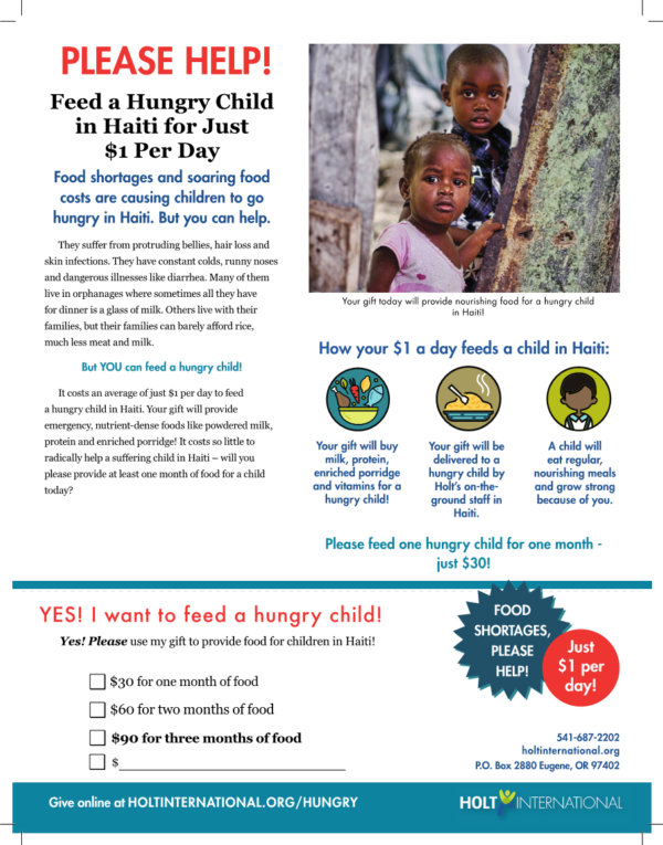
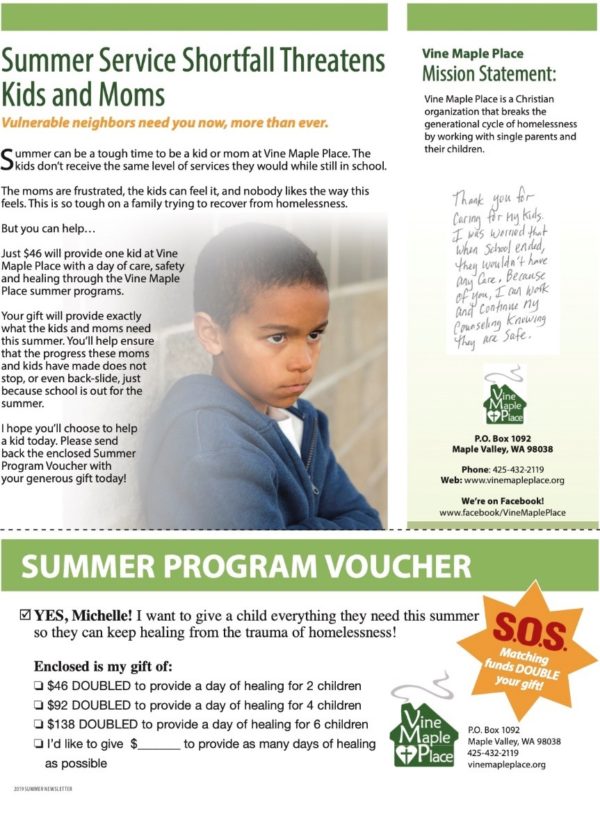
- The bottom of the back page should be what we call a ‘faux reply card.’
- The faux reply card is not meant to be cut off and sent back. The separate reply card you include with your newsletter is what will be sent back. The faux reply card is added because in head-to-head testing it increased the number of people who sent in a gift by 15%.
A successful back page tends to look like this…

Or this…

Want to Get Even More Donors to Take Action?
Pro-level newsletters select their stories to set up the offer that’s used on the back page.
In other words, if the back page is going to tell a story of need about feeding children, the stories in the rest of the newsletter will all be about children who the donor helped feed. Or if the back page is going to share a need to do advocacy work on an issue, the stories in the rest of the newsletter will all be about how the donor has helped fund successful advocacy work.
Put slightly differently: each newsletter has a theme, and the theme is directly related to the offer. The greater the percentage of content that is not on-theme, the lower the amount of money the newsletter will raise.
Your newsletters do not need to be perfectly themed to succeed. But in our experience it increases the chances you’ll raise more money.
Feelings
It may feel weird to have a story of need and a reply card on the back of your newsletter.
Your newsletter is a Report, after all.
But it works great. This approach raises more money than any other approach that was tested.
And there are no negative consequences to doing your newsletter this way. People do not complain about it. You do not lose donors because of it.
You simply start raising more money with your newsletters. And retaining more of your donors. Because remember, your donors love to give. All you’ve done with this method is proven to your donor that her previous gift made a difference, then given her a reason to give another gift today.
Read the series:
- What the purpose of your newsletter SHOULD be
- Why are you writing about the organization?
- What your next newsletter should be like
- Outline for newsletter stories
- Newsletter Headlines That Work
- Newsletter Picture Captions that Help, not Hurt
- Newsletter Design: Readable and Scannable Above All Else
- Who to Mail Your Newsletter To
- The Back Page: How to Turn Those Good Feelings into Donations (This Post)
This post was originally published on August 6, 2020.
Steven Screen is Co-Founder of The Better Fundraising Company and lead author of its blog. With over 30 years' fundraising experience, he gets energized by helping organizations understand how they can raise more money. He’s a second-generation fundraiser, a past winner of the Direct Mail Package of the Year, and data-driven.


One comment on “The Back Page: How to Turn Those Good Feelings into Donations”