Your Printed Newsletter: The final Big Idea that brings it all together

newsletter

Your printed newsletter should be raising a lot of money – as much as your appeals and, in some cases, even more.

The goal of this series has been to give you a tested, proven approach to creating a donor-delighting, money-raising printed newsletter:

  • Direct mail experts ran a series of head-to-head tests of different types of printed newsletters. The approach detailed here beat all the other approaches.
  • We’ve used this approach since 2004 to reliably (and sometimes incredibly) increase the money nonprofits raise from their newsletters.
  • We’ve taught this model at conferences, seminars and webinars.  We’ve received hundreds of pieces of feedback about how the approach increased newsletter revenue.  You do not need to be an expert to follow this model and raise more money

So take it this approach and apply it to your organization.  Test it against your current approach, or any other approach.

Be Intentional with Your Newsletter

Figure out what your organization’s approach is.  Discover and name your organization’s underlying assumptions. 

  • Maybe your organization believes that printed newsletters are obsolete.  (They aren’t.)
  • Maybe your organization believes that printed newsletters shouldn’t or can’t raise money.  (Neither is true.) 
  • Maybe your organization believes the way you’ve always done your newsletter is the only way your organization can do a newsletter.  (Not true.)
  • Maybe your organization fears that if you change your newsletter in any way, your donors will leave.  (Also not true.)
  • Maybe your organization believes you could do a newsletter like the one taught here, but you could never do an Ask along with it, because it would offend donors.  (You guessed it, not true!)

I’ve run into all of these beliefs before.  And it doesn’t matter what you believe – what matters is that you identify what you believe that results in your current approach.  Then you compare it with the approach outlined in this series and decide which approach to take.

Great newsletters don’t raise money by accident.  Content is included for a purpose, and content is excluded for a purpose.

And remember: the primary reason donors read your newsletter is not to hear about your organization. They’re reading because they’re hoping to hear about themselves.  Specifically, donors are reading to find out if they and their gift made a difference.

So start with this proven approach that shows and tells donors how they made a difference.  And good luck!

This post was originally published on August 11, 2020 in a series of 10 posts on Donor-Delighting Newsletters. This series has been published as an e-book that can be downloaded here.

The Back Page: How to Turn Those Good Feelings into Donations

pages

The back page of your print newsletter is where your donor’s good feelings can turn into another gift… or not.

What’s Happened So Far

If you’ve followed the newsletter approach I laid out starting here, your donor has scanned three pages of your newsletter. Those pages have been full of stories that show and tell the donor how she and her gift made a difference.

You’ve proven to her that her gift to your organization was a good decision.

Unlike other organizations who have sent your donor chest-thumping puff pieces about how busy and heroic their organization is, you have made your newsletter about the donor who is reading it.

She’s thinking, “Finally, an organization that gets me and what I’m trying to do.”

And she feels great!

Let’s Turn Those Feelings into Action

Here’s how to get a regular percentage of those donors to make a gift right then and there:

  • Feature one story on the top of back page.
  • That story should be a “story of need” (this is different than the “stories of success” mentioned in this post in this series)
  • The need should be a need that your beneficiaries or organization are currently facing, or are going to face in the next two months.
  • Describe how the donor’s gift today will perfectly meet the need. This is your Offer, and you can download this free eBook if you’d like to know more about how Offers work and how to create a great one.
  • The bottom of the back page should be what we call a “faux reply card.”
    • The faux reply card is not meant to be cut off and sent back. The separate reply card you include with your newsletter is what will be sent back. The faux reply card is added because in head-to-head testing it increased the number of people who sent in a gift by 15%.

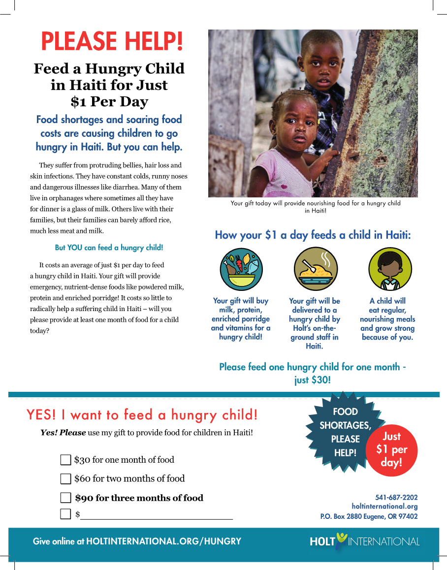
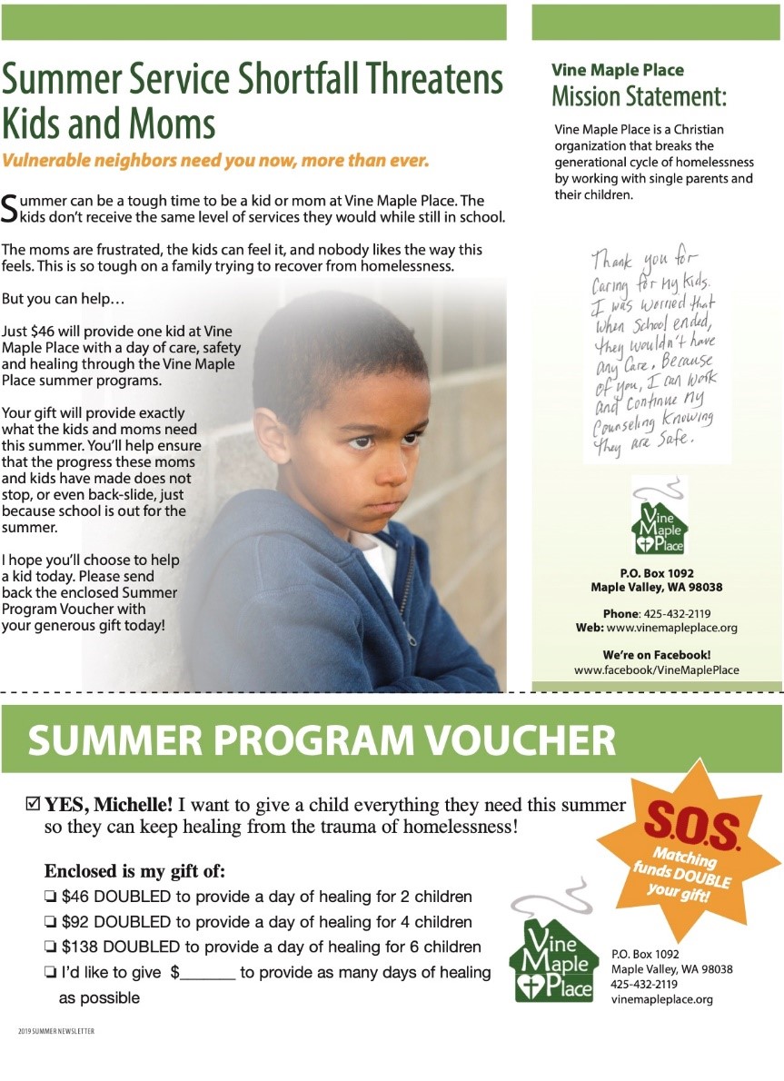
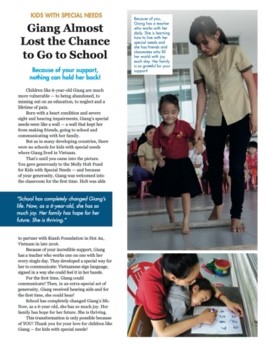
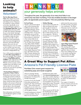
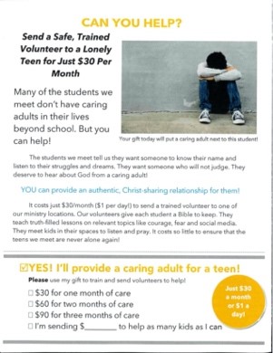
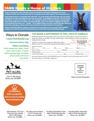
A successful back page tends to look like this…

Or this…

Want to Get Even More Donors to Take Action?

Pro-level newsletters select their stories to set up the offer that’s used on the back page.

In other words, if the back page is going to tell a story of need about feeding children, the stories in the rest of the newsletter will all be about children who the donor helped feed. Or if the back page is going to share a need to do advocacy work on an issue, the stories in the rest of the newsletter will all be about how the donor has helped fund successful advocacy work.

Put slightly differently: each newsletter has a theme, and the theme is directly related to the offer. The greater the percentage of content that is not on-theme, the lower the amount of money the newsletter will raise.

Your newsletters do not need to be perfectly themed to succeed. But in our experience it increases the chances you will raise more money.

Feelings

It may feel weird to have a story of need and a reply card on the back of your newsletter.

Your newsletter is a Report, after all.

But it works great. This approach raises more money than any other approach that was tested.

And there are no negative consequences to doing your newsletter this way. People do not complain about it. You do not lose donors because of it.

You simply start raising more money with your newsletters. And retaining more of your donors.

Because remember, your donors love to give. All you’ve done with this method is proven to your donor that her previous gift made a difference, then given her a reason to give another gift today.

This post was originally published on August 6, 2020 in a series of 10 posts on Donor-Delighting Newsletters. This series has been published as an e-book that can be downloaded here.

Print Newsletter Design: Readable and Scannable Above All Else

Newsletter design.

For the smaller nonprofits out there, who don’t have super-pro Designers creating their newsletters, do not worry.

Your newsletter does not need to have fancy or complicated design to be successful.

In fact, fancy and complicated design usually lowers readability – which lowers the effectiveness of your newsletter.

What you’re going for is “clean and easy to read.”

Here are a bunch of examples – kept purposefully small. You will be able to tell at a glance which ones are readable… and which aren’t. 

This, Not That

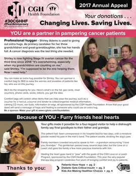
This cover…

Not this cover…

That second cover has too much going on. I think there are six elements in the header alone. Too much copy. Seven different type treatments.

This interior page…

Not this interior page…

That second interior page has far too much copy. The one photo is too small. 

This back page…

Not this back page…

The second back page has waaay too much “reverse text” (white text on a dark background) which is very hard to read for older donors. Plus it’s a self-mailer, which raises less money than newsletters that follow the format taught in these blog posts.

The lesson here: look at your newsletter from a few feet away. Does it look friendly?  Easy to read?  Or does it look thick with information and visually cluttered?

That’s Fine, But What Do I Do?

Here are the general newsletter rules we live by:

  • Not too much text
  • 13 point typeface or larger
  • Headlines, subheads and picture captions should always be in a high-contrast color (preferably black)
  • Use reverse text only when it’s a couple/few words in larger type
  • Black text on a white background is always the most readable
  • Don’t put your text in colors that are low contrast (they are harder to read for older donors). 
  • 2 or 3 text columns max

Know What’s Most Important

The trick is to know what’s most important.

If you’re judging your newsletter by asking, “Does it look nice and use our brand colors?” you’re asking the wrong question.

The first, most important question is, “Is it easy to read and convey our main message in a couple seconds?”

Nail that. Then add graphic elements and flourishes but keep the text readable. 

Because remember, it’s all about readability. If fewer people read your fundraising, fewer people give to your fundraising. So make your fundraising newsletter easy to read!

This post was originally published on July 23, 2020 in a series of 10 posts on Donor-Delighting Newsletters. This series has been published as an e-book that can be downloaded here.

Newsletter Picture Captions that Help, not Hurt

Newsletter captions.

People read picture captions.

So make sure your picture captions do a great job delivering your newsletter’s main message.

Thankful there’s an easy way to do this…

One Simple Rule

Here’s how we think about every newsletter picture caption.

The caption should not be about what’s happening in the photo.

The caption should be about the donor’s role in what’s happening in the photo.

Which means every single picture caption should mention the donor.

Example Time

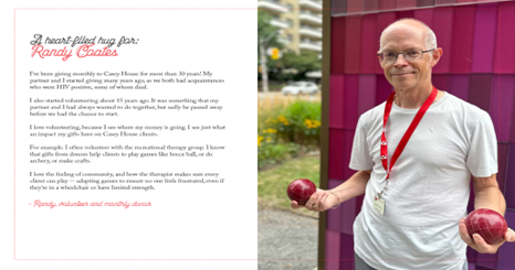
Here are a bunch of examples from real, money-raising, donor-retaining newsletters…

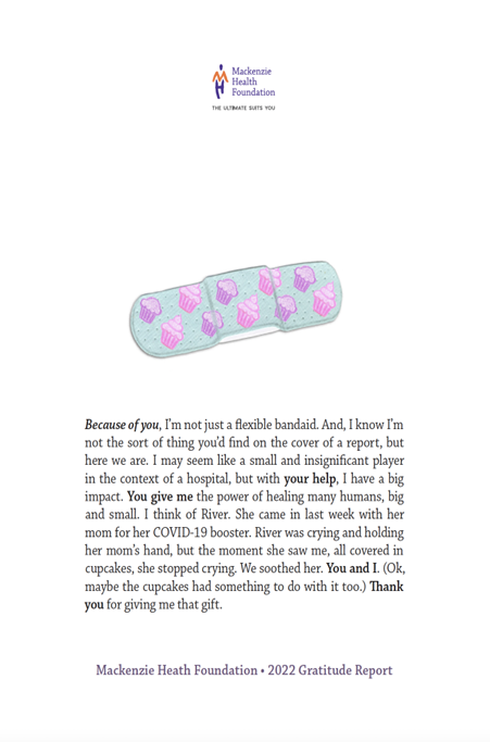
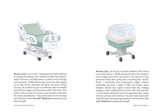
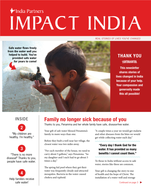
Thanks to you, Linh and her baby are both getting the food, basic necessities and long-term support they need!

Because of your generosity, doctors were able to repair Jun Jun’s cleft lip.  Jun Jun will join his adoptive family soon!

Your generosity helped Maria re-discover the courage and strength she had lost while she was homeless.

Devi was able to begin her freshman year (making her dreams come true!) with everything she needed for her dorm room at Georgia Tech thanks to you.

Your gift helped women in Uganda receive the physical and emotional healing they desperately needed.

This year’s graduating class celebrates – thanks in part to your generous giving!

Your generosity has trained more than 500 police officers and first responders to stop and prevent child abuse.

Answer the Question Your Donor is Asking

One of the questions running through a donor’s mind as she looks at your newsletter is this: “did my gift make a difference?”

Photo captions that follow this model show and tell her, again and again, how her gift made a difference.

They answer her main question.

And remember: when your donor knows that her gift made a difference, she trusts your organization more.

When she trusts your organization more, she’s more likely to respond to the next appeal you send her.

So, because newsletter photo captions are one of the most widely read parts of your newsletter, they are wildly important for you to use correctly to let your donor know that she and her gift made a difference.

Follow the simple rule above and you’ll be on your way to raising more money and retaining more of your donors!

This post was originally published on March 12, 2020 in a series of 10 posts on Donor-Delighting Newsletters. This series has been published as an e-book that can be downloaded here.

Newsletter Headlines That Work

Newsletter headline.

The previous post gave you a simple outline for how to easily write newsletter stories.

Today is about newsletter headlines; a massively important part of your newsletter’s success, but a part that most organizations spend very little time on.

Remember our belief that about 80% of the people who open your newsletter will read only your headlines and picture captions?

Doesn’t that make your headlines important? Maybe even more important than the story the headline is for?

We think so. So here’s how to write successful headlines…

Headlines Have One of Two Jobs

We try to do one of two things with newsletter headlines.

  • Be so dramatic and interesting that the reader wants to read the article. Think of this this way; the headline is the ad for the story. And/or…
  • Share the outcome of the story and involve the donor. Think of it this way: your reader should know, just from reading the headline, that their gift did something powerful.

Example Time

Here are a handful of examples of ineffective headlines – taken from real newsletters in our files – that do not accomplish either of the objectives above:

  • IFI Training Day Expands
  • Elizabeth’s experience encourages others to get their annual mammogram
  • Committed to change lives
  • Together We Rise
  • 5th Annual Zip 5k + Fun Run Breaks Record For Participation
  • Board Of Directors Highlights/News
  • What is Extreme Poverty?
  • Upcoming Fundraisers
  • Camp and Retreat Centers as Holy Ground
  • Staff Updates
  • Pathways Supported Employment program fills in the missing pieces for people recovering from homelessness

And here are examples of effective headlines:

  • You’re helping find “Desperately needed” new treatments
  • “I wanted to Die”
  • The power of One Meal
  • “There is no more disease!”
  • Blind from a Chemical explosion, today he can see!
  • You did this!
  • You’re a hero!
  • Food delivered!
  • He used to eat garbage, you gave him dumplings!
  • “We never expected this to happen”
  • Cancer Patient Living On French Fries And Soda Pop
  • From Abuse to Prison to Redemption
  • “Your baby has cancer”
  • 100 Happy Children
  • You helped save Darryl’s life
  • The Joy of Clean Water – Thanks to You!

Take a look at those effective headlines again.

Don’t you want to read the stories for those more than you want to read the stories after the boring headlines?

And don’t you know – just from scanning the good headlines — that your gift made a meaningful difference?

In other words, you didn’t even have to read the story and you knew your gift made a difference. Which made you trust the organization a little bit more. Which made you more likely to give them a gift the next time they asked you. Which made the organization raise more money and retain more of its donors.

All that from a good headline.

You are in a BATTLE for your donor’s attention

Always remember: nobody has to read your fundraising.

You’re competing with people’s phones, with the internet, with making dinner, and with all of the other mailings from nonprofits that your donor received that very same day.

Strong dramatic and/or donor-focused headlines are one of the most powerful tools you have to convey your main message and get donors to read your stories! They are an integral part of whether your newsletter is going to raise money… or not.

So go look at your headlines – for both your printed newsletter and your e-newsletter. If they aren’t doing either of the two jobs above, it’s time to fire them and get some headlines that will do their jobs. There’s too much at stake to have your headlines causing fewer people to read your newsletter!

This post was originally published on March 5, 2020 in a series of 10 posts on Donor-Delighting Newsletters. This series has been published as an e-book that can be downloaded here.

Outline for Newsletter Stories

newsletter.

Here’s the outline we follow for newsletter stories.

It’s remarkably simple and it does two powerful things:

  1. It makes your newsletter easier and faster to write because you have a model to follow
  2. It makes sure each story helps you achieve the purpose of your newsletter

Sounds pretty good, doesn’t it?

Simple Newsletter Outline

PARAGRAPHS 1-2

  • Summarize the situation the beneficiary was in
  • Tell the donor the situation changed because of them
  • Summarize the positive situation the beneficiary is in today

PARAGRAPHS 3-5

  • Tell the beneficiary’s “story” as above, but go into more depth

FINAL PARAGRAPH

  • Thank the donor for making the transformation (from “before” to “after”) possible
  • Thank the donor for caring about the beneficiary enough to take action to help

The Power of This Approach

When you use this approach, your donor does not have to read more than the first paragraph to get your newsletter’s main message; that the donor’s gift made a meaningful difference in the life of one person or for your cause.

At Better Fundraising, we assume that 80% of the people who open your newsletter will only read the headlines, picture captions, and a paragraph or two. For those people (4 out of 5!) you want to do everything you can to ensure they still get your main message.

Other nonprofits will make their donors wade through tons of words to find out whether donors’ gifts made a difference. Sometimes the donor will never find out. I’ve seen newsletters where the donor is never even be mentioned.

But by following this model, you and your organization will communicate your main message to almost every person who opens your newsletter. That’s a huge win!

Repeat This Formula in Every Story

When a donor opens your newsletter you don’t know which story (or stories) they are going to read. So you want to use this formula for every story so – whatever they read – they get message that their gift made a difference.

This approach will feel repetitive to you – who sees every story. But vast majority of your donors won’t read every story.

It will feel repetitive to your staff and core stakeholders like your board because are far more likely than most donors to open every newsletter and read every story.

But Remember …

Your newsletter is not for you, your staff, or for your core stakeholders. It’s a communication vehicle to show the remaining 95% of your donors that their gift made a meaningful difference.

Why is showing donors that they made a meaningful difference so important?

So that they trust that giving a gift to your organization makes a real difference.

So that they are more likely to give you a gift the next time you ask.

So that they are more likely to keep giving to you year after year.

So that they are more likely to become a major donor.

So that they are more likely to leave you a gift in their will.

So … no pressure … but make sure your newsletter shows each donor that their gift made a meaningful difference. And one of the most powerful ways to do that is to write the stories following this outline.

This post was originally published on March 3, 2020 in a series of 10 posts on Donor-Delighting Newsletters. This series has been published as an e-book that can be downloaded here.

What your next print newsletter should be like

newsletter.

It’s time to get tactical.

We gave you a couple big ideas for how to think about your print newsletter. (If you want to delight your donors and raise more money, that is.)

Now as we move into the details, here’s a summary for the elements of your newsletter:

  • Send it in a #10 or larger envelope (not a self mailer)
    • Teaser should be “Your newsletter enclosed”
  • 4 pages long (1 tabloid-sized sheet, folded in half to make 4 pages)
    • The first three pages should be Stories of Success; between 2 and 4 stories, each about an individual beneficiary, each sharing the “before” and the “after” for that beneficiary, and each giving credit to the donor for making the transformation happen
    • The back page should be a Story of Need with an offer: this is a story that describes a current need being faced by beneficiaries, and a description of how the donor’s gift of a certain size will perfectly meet the need for one person
  • A separate reply card, with bonus points for pre-printing the donor’s info and customizing the gift ask amounts based on the donor’s previous gift
  • A separate reply envelope that the donor can use to send back their gift

Of course there are other newsletter formats that work.

But if you’re looking to improve your newsletter, this particular way has been battle-tested by thousands of nonprofits.

It’s worked so many times for so many types of organizations that it’s our “default setting.” In other words, if a nonprofit asks Better Fundraising to create a newsletter – and we’re going to be retained or fired based on the results – this is the model we follow. It’s the model we recommend to all of our clients, the model we speak about at conferences, etc.

Why So Specific?

My goal is to show you exactly what to do to raise money and delight your donors, and to take the mystery out of successful nonprofit newsletters.

We want to make it as easy as possible for you. I heard from a client earlier today who said, “The reduction in anxiety from having a proven model to follow is priceless.”

That’s what we’re offering here. And next, we’ll tackle how to write your stories, how to design your newsletter, who to send it to, even the best way to write headlines and picture captions. Stay tuned!

This post was originally published on February 27, 2020 in a series of 10 posts on Donor-Delighting Newsletters. This series has been published as an e-book that can be downloaded here.

“Why are you writing about the organization?”

Thinking writing.

This is the second post in our series on donor-centered print newsletters. The kind of newsletters that delight donors and raise more money for your nonprofit.

The first post was about the purpose of your newsletter. This post is the second and final Big Idea you need to succeed.

And after this – I promise – the posts will get tactical.

But if you don’t know this one idea, all the tactics in the world won’t help very much.

A Powerful, Unexpected Question

It’s 1994. I’m less than a year out of college working at a fundraising agency that specializes in helping large nonprofits raise money. And I’m writing my first newsletter.

I handed my draft to my boss – an accomplished, brilliant fundraiser.

He read the first story, scanned the rest of the stories, and handed the stack of paper back to me.

Then he asked me a powerful but unexpected question:

“Why Are You Writing About the Organization?”

I didn’t know it at the moment, but that was one of the most powerful lessons I ever learned about effective fundraising.

At the time all I could do was say, “What do you mean? It’s … the organization’s newsletter.”

“Sure.” My boss said, “but most donors aren’t reading a newsletter to find out anything about the organization. They are reading it to find out if their gift made a difference.

“The most effective newsletters are written to show donors what their gift accomplished. And the best way to do that is through stories about beneficiaries.

“So stop writing about the organization and its programs. Start writing about the donor and telling her stories about lives that have been changed because of her kindness. Then she’ll think it was a great idea to give to the organization, and be more likely to give again.”

So … I went back to my office to do a complete rewrite.

But I was a far more effective fundraiser from that moment forward.

Your Newsletter

As you create your newsletter, you will be tempted to “write about your organization.”

People in your organization will even push you to write about your organization.

They’ll say things like, “But we have to tell people about everything we do and tell them that we’re good at it!”

No. You don’t. In fact, when you do, fewer donors will read your newsletter. Because hearing about your organization is not why they are reading. They are reading because they are hoping to hear about themselves. Whether and how their gift made a difference. Whether they are a valuable part of your organization.

Keep this idea in mind as you read this series. Then all the tactics – the writing style, the headlines, the picture captions – will make sense.

You’ll start keeping your donors for longer. And your newsletter will become a major revenue source!

This post was originally published on February 25, 2020 in a series of 10 posts on Donor-Delighting Newsletters. This series has been published as an e-book that can be downloaded here.

What the purpose of your newsletter SHOULD be

Newsletter.

This is the first in a series of posts that will show you how to create donor-delighting, money-raising newsletters.

We’re talking about newsletters that your donors love to open, the kind that increase the chance they’ll keep giving to your organization year after year, and the kind that raise way more money than they cost to send out.

What Is Your Newsletter’s Purpose?

Here’s our approach, and it’s been successful for every type of organization in every sector we’ve tried:

Your newsletter exists to show your donor how her gift made a difference, and to show her what her gift today will do.

There’s a lot in that one sentence, which we’ll unpack during this series.

But it’s just as helpful to understand what your newsletter should not be:

  • It should not a newspaper, full of all kinds of
    stories
  • It should not be about your organization, your programs,
    your staff, your volunteers, your sponsors, or your partners
  • It should not be about how much money you’ve
    raised
  • It should not be a “playbill” about the
    upcoming events and ways a donor can get involved
  • It should not “hide the good news” by only
    mentioning the donor at the very end of stories

And yet, those are the things that most nonprofits use their newsletters for.

 That’s why most newsletters don’t get read.

 That’s why they don’t measurably help organizations keep their donors.

 And it’s why most newsletters don’t raise much (if any) money.

Here’s the Big Idea:

Your donor is more interested in reading about herself – about what she and her gift did – than she is reading about any of those other things.

So if you want her to read your newsletter, write to her and write about her.

You Need a To-do list and a Not-To-Do List

Newsletters don’t raise a lot of money by accident.

The content is curated and the offer decided. Then it’s written and designed with the intent to raise money.

Everything included in it is done with a purpose. That means that a bunch of things are also excluded on purpose.

For smaller organizations, this is hard, because it means telling some staff that their program will never be featured in the newsletter. It means getting more stories and photos of beneficiaries. It means the “save the date” for your next event needs to be an additional mailing, not in your newsletter.

It’s hard, but it’s worth it. This approach works measurably better than any other approach I’ve ever seen in my 27 years of fundraising.

If you’d like to know more, stay tuned (and subscribe to our blog if you haven’t already)!

This post was originally published on February 20, 2020 in a series of 10 posts on Donor-Delighting Newsletters. This series has been published as an e-book that can be downloaded here.