
For the smaller nonprofits out there, who don’t have super-pro Designers creating their newsletters, do not worry.
Your newsletter does not need to have fancy or complicated design to be successful.
In fact, fancy and complicated design usually lowers readability – which lowers the effectiveness of your newsletter.
What you’re going for is “clean and easy to read.”
Here are a bunch of examples – kept purposefully small. You will be able to tell at a glance which ones are readable… and which aren’t.
This, Not That
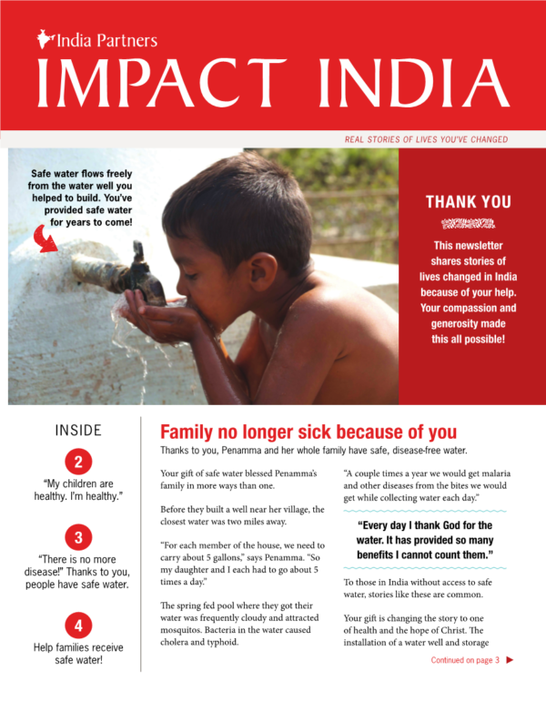
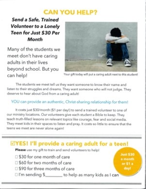
This cover…
Not this cover…
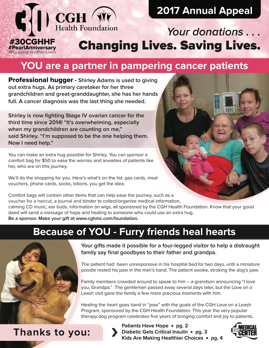
That second cover has too much going on. I think there are six elements in the header alone. Too much copy. Seven different type treatments.
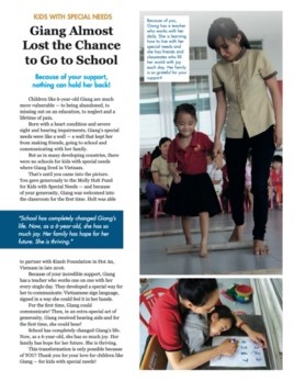
This interior page…
Not this interior page…
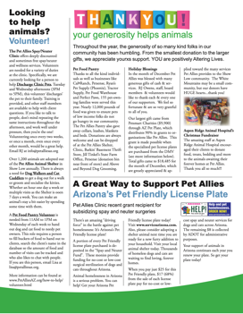
That second interior page has far too much copy. The one photo is too small.
This back page…
Not this back page…
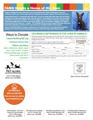
The second back page has waaay too much “reverse text” (white text on a dark background) which is very hard to read for older donors. Plus it’s a self-mailer, which raises less money than newsletters that follow the format taught in these blog posts.
The lesson here; look at your newsletter from a few feet away. Does it look friendly? Easy to read? Or does it look thick with information and visually cluttered?
That’s Fine, But What Do I Do?
Here are the general newsletter rules we live by:
- Not too much text
- 13 point typeface or larger
- Headlines, subheads and picture captions should always be in a high-contrast color (preferably black)
- Use reverse text only when it’s a couple/few words in larger type
- Black text on a white background is always the most readable
- Don’t put your text in colors that are low contrast (they are harder to read for older donors).
- 2 or 3 text columns max
Know What’s Most Important
The trick is to know what’s most important.
If you’re judging your newsletter by asking, “Does it look nice and use our brand colors?” you’re asking the wrong question.
The first, most important question is, “Is it easy to read and convey our main message in a couple seconds?”
Nail that. Then add graphic elements and flourishes but keep the text readable.
Because remember, it’s all about readability. If fewer people read your fundraising, fewer people give to your fundraising. So make your fundraising newsletter easy to read!
Read the series:
- What the purpose of your newsletter SHOULD be
- Why are you writing about the organization?
- What your next newsletter should be like
- Outline for newsletter stories
- Newsletter Headlines That Work
- Newsletter Picture Captions that Help, not Hurt
- Newsletter Design: Readable and Scannable Above All Else (This Post)
- Who to Mail Your Newsletter To
- The Back Page: How to Turn Those Good Feelings into Donations
- Your Printed Newsletter: The final Big Idea that brings it all together

Steven Screen is Co-Founder of The Better Fundraising Company and lead author of its blog. With over 30 years' fundraising experience, he gets energized by helping organizations understand how they can raise more money. He’s a second-generation fundraiser, a past winner of the Direct Mail Package of the Year, and data-driven.
- Steven Screen

- Steven Screen

- Steven Screen

- Steven Screen


3 comments on “Newsletter Design: Readable and Scannable Above All Else”