Make Your Website Accessible

User-friendly interface.

I had the opportunity to work with an incredible fundraiser at a nonprofit I used to work at.  And one of the things he taught me (among many others) was that colors aren’t visible to everyone the same way.

He showed me how, on our website, the two colors used in our organization’s marketing were difficult for him to see.

We realized that our fundraising could reach so many more people who cared about our mission if we made a few adjustments.

Here are some beginning ideas to make your online content more accessible to your donors – especially to your donors with older eyes.

  • Use high-contrast text, and minimize reverse text where possible.  Try a contrast checker to see if the colors you’re using are easily readable and high-contrast.
  • Check to make sure your font is large enough and easily readable.  For online reading, a sans serif font works best.
  • Make your donation form simple and quick.
  • Use alternative text and photo captions that clearly summarize photos and what you want the donor to do.

These are just a few ways to get started.  I’m definitely not a web designer or accessibility expert, but I’ve learned that we can always be looking for ways to improve, educate our teams, and create a culture that prioritizes accessibility in our fundraising.

PS — Want to dig deeper?  Try putting your organization’s website into WAVE.  This tool will evaluate your website’s accessibility according to the Web Accessibility Guidelines.

Could Your Fundraising Be More Accessible?

Accessible.

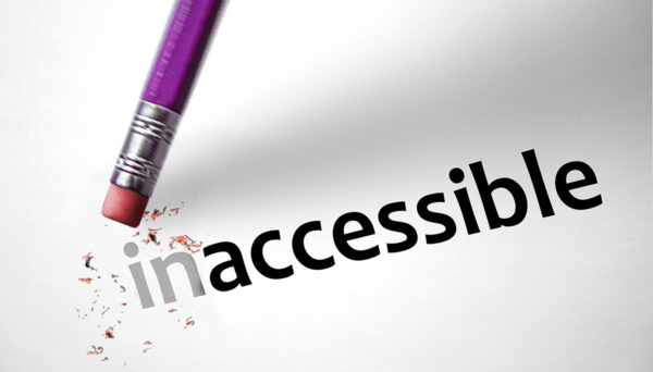
Here’s a goal for your fundraising in 2024 – make it more accessible.

The ethical reasons are clear: we should not make unnecessary design and language choices that make it harder for people to see, read and understand.

Additionally, the financial reasons are clear:

  • When more people can easily read your fundraising, more of your fundraising will be consumed, and you’ll raise more money.
  • When more people can quickly understand your fundraising, more people will keep reading, and you’ll raise more money.

Our next three blog posts will be full of tips for how you can make your fundraising more accessible.  All of the tactics we’ll share, as well as the overall idea, are part of the Universal Design movement.  (But we just call it smart fundraising 🙂 )

In the meantime, take a look at your fundraising and ask yourself:

  • Is the text easy for an older person to read?
  • Is the design easy for a “scanner” to quickly know what’s most important?
  • Is the copy written so that the reader needs a college education to understand it, or is it accessible to people with less education?

It’s emotionally stretching for an organization to make their fundraising more accessible.  But you’ll be doing the right thing.  And in my experience, you’ll also raise more money.

Quick Note on Type Size

Using larger type in your fundraising materials is both smart and the right thing to do.

Here’s what Health.gov says about type size:

“Choose a font that’s at least 16 pixels, or 12 points. If many of your users are older adults, consider using an even larger font size — 19 pixels or 14 points. A small font size is more difficult to read, especially for users with limited literacy skills and older adults.”

Smart

Using larger type is smart because it’s proven to be more readable (especially for older adults). 

When your fundraising is more readable, more of it gets read.

When more of your fundraising gets read, you raise more money.

So using large, easy-to-read type is smart fundraising because you’ll raise more money for your cause.

The Right Thing to Do

Using larger type is also the right thing to do.  It makes your fundraising more accessible to more people. 

In the same way that having a strong mass donor fundraising program is good for your organization’s DEI efforts, so is using easy-to-read type.

Use larger type – don’t accidentally put up a barrier between your organization and older adults!