For your individual donors, your nonprofit’s brand is far more than your visual identity and voice.
Your brand is also:
Whether your fundraising is accessible, or takes thought and education to understand
Whether it’s easy to give you a gift online, or not
Whether you “report back” to donors that their gift made a difference, or you brag about how big a difference your organization makes (“We helped 4,317 people last year!”)
Whether you thank donors promptly, or not
For individual donors, your brand is the total experience a donor has while donating to your nonprofit.
For most small nonprofits, the “next step” to strengthening your brand with individual donors has nothing to do with your visual identity, and everything to do with your donors’ experience.
Our previous post noted that organizations who design all their fundraising pieces to “look nice and use their brand colors” accidentally cause their organization to raise less money.
Yet this approach persists. It’s arguably the most common approach!
I think there are two reasons it persists, and each of them is a good lesson for all of us Fundraisers to remember:
Lack Of Differentiation
At the vast majority of nonprofits, people aren’t taught that the design considerations for designing appeal letters are different than the consideration when designing a brochure or an annual report.
In direct response fundraising, there are some design approaches that are proven to work better than others.
It’s not your fault because you weren’t trained how to do this stuff.
There are many product- and corporate-branding principles that have been widely misapplied to the nonprofit world.
Here’s a summary of the resulting approach: “If our fundraising stays on brand all the time, that is good for our brand and will cause more people to give money over time.”
That’s true IF (and only if) your brand is effective in all the contexts in which you fundraise.
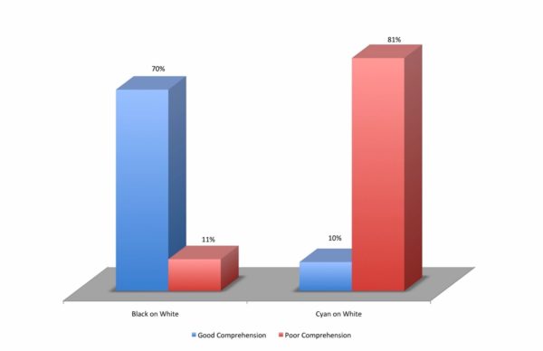
For instance, say one of a nonprofit’s brand colors is cyan (light blue) or something similar. And in order to stay on brand, the nonprofit uses cyan for some of the text in its newsletter.
Cyan, because it is so low contrast, is almost impossible to read by most people. Look at what using cyan (compared to black) does for reading comprehension:
While this color can be very effective in creating a feeling as part of a brand’s palette, it’s ineffective when used as a text color.
So the brand is effective in one context, but not in others.
In that case, ‘staying on brand all the time’ absolutely does not help the organization raise more money now, or in the future.
The lesson here is that brand consistency (looking and feeling the same in all contexts) matters less than brand relevancy (being relevant and effective in whatever context you’re working in at the moment).
The next time you’re asked to design a piece of fundraising – or you ask someone to design a piece of fundraising for you – ask these two questions:
What type of fundraising are we creating here?
What are the hallmarks of effective design in this context?
The ability to differentiate, and then to know what effective design looks like in different contexts, will help an organization achieve more of its mission than an over-devotion to using its brand colors.
Your brand is what your donors
consistently experience.
Your brand is also your logo and
your colors and how you describe your work. Those things matter.
But in my experience, they don’t matter
as much as what your donors experience during and after they give a gift to
you.
A
Brand is an Experience
There’s a big difference between a
nonprofit brand and a product-based brand. When you purchase a product, you get
to experience the product. You know if it’s well-made or not. You know if you
feel good or look good with it.
But when your donor makes a gift to
your organization, she doesn’t receive any product. The only thing your donor
receives are your ongoing donor communications.
So it’s your donor’s experience of
seeing, reading, and then feeling emotions caused by your communications that
are your brand to her.
You might think it’s your logo and
colors. But that’s a small part of the experience for her.
Three
Branding Elements that Raise Money
Here are the three things that I see –
the “brand elements” if you will – that make the most difference in small- to
medium-sized nonprofit branding.
If your fundraising doesn’t have these
elements, you can start raising more money immediately by adding them in the
right places.
Make your donor feel needed. Donors love to feel needed! Do you tell her directly that she’s needed? Do your communications reinforce that she and her gift are needed? Telling her you need “partners” or asking her to “continue our good work with your support today” do not do this. This happens best anytime you’re asking for money: appeals, e-appeals, events, etc.
Make your donor feel great when she gives a gift. Does your receipt arrive fast? Does it acknowledge the intent of her gift (if you know it)? Is it followed with a phone call? A personal note? Any nonprofit can make a donor feel acknowledged – but does your Thanking process and content make a donor feel special?
Regularly tell your donors what their giving accomplished. An annual report and standard-issue nonprofit e-news do not do this. You have to intentionally communicate to donors the impacts of their giving, in language they understand, and give them the credit for the change. Look at your donor communications and read the words carefully – do they tell your donor what your organization did, or do they tell your donor what she did?
I know most nonprofits don’t think
about their brand in this way. But in my experience, these three elements, far
more than elements like “your organization’s competency” or a tagline, are the
active ingredients of a nonprofit brand that engages donors and keeps them
giving.
So focus on these three elements. They
move the needle more.
Add them to your brand and you’ll start
raising more money immediately. And you’ll raise more money in the long term
because you’ll keep more of your donors.