I want you to think about the graphic above the next time you look at your Thank You/Receipt letter.
Why? Because let’s make sure you’re not accidentally hiding the main message you’re trying to send a donor right after they’ve given you a gift!
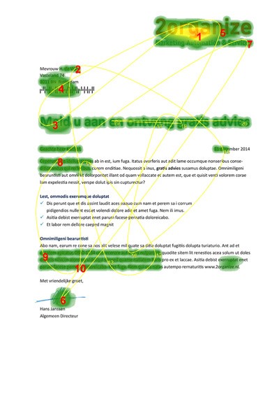
Heat Maps
The graphic above is what’s called a “heat map.” It tracks where reader’s eyes looked as they read this piece of direct mail fundraising. It also tracks the order in which the Reader looked at each area.
Not all heat maps look the same, but they generally look like this one.
And if you look at any of them, you quickly see that donors tend to read the beginnings and endings of your messages, and not much in between.
A Question for You
I want you to visualize your organization’s Receipt letters and Thank You letters. Better yet, print them out and put them on your desk.
With this heat map in mind, do your receipt letters and Thank You letters actually communicate what you are trying to communicate?
Is it easy for a donor to read that she is being thanked, and that your organization is full of gratitude for her?
Or have you accidentally hidden the main message in places where your donors are less likely to read them?
My advice is to make sure that there is a clear Thank You in two of the following three places:
- The first sentence
- The last sentence
- In the upper right corner
Why two of the three? To increase the chances that a “skimmer” will read one of them. Because you don’t know what part a donor is going to read!
Your Assignment
I could go deeper on all this. But I’d rather you spend your time looking at your Thank You and Receipt letters. Same thing goes for the email versions.
Make sure that your message of gratitude is easily seen at just a glance – because that’s often all you get!
Does the rest of your message need to be well-written? Of course (I talk about it in this post). But a surprising amount of Thank You success is dependent on getting the top and bottom correct!

Steven Screen is Co-Founder of The Better Fundraising Company and lead author of its blog. With over 30 years' fundraising experience, he gets energized by helping organizations understand how they can raise more money. He’s a second-generation fundraiser, a past winner of the Direct Mail Package of the Year, and data-driven.
- Steven Screen

- Steven Screen

- Steven Screen

- Steven Screen


Good info!
I’m curious to know if any studies have been done to track the skimmers’ viewing for hand-written letters vs. electronically-printed notes.
Hi JB, that’s a great question. I’ve never seen a study on that. But if I were to make a wager, I bet the pattern would be very similar. I say that because I’ve seen heat maps for direct mail, email, and web pages. They all tend to follow the classic “F”-shaped pattern and I can’t think of a reason why a handwritten letter would result in a different pattern.