Print Newsletter Design: Readable and Scannable Above All Else

Newsletter design.

For the smaller nonprofits out there, who don’t have super-pro Designers creating their newsletters, do not worry.

Your newsletter does not need to have fancy or complicated design to be successful.

In fact, fancy and complicated design usually lowers readability – which lowers the effectiveness of your newsletter.

What you’re going for is “clean and easy to read.”

Here are a bunch of examples – kept purposefully small. You will be able to tell at a glance which ones are readable… and which aren’t. 

This, Not That

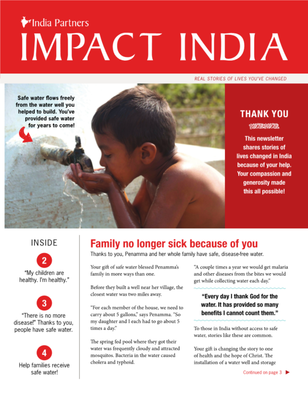
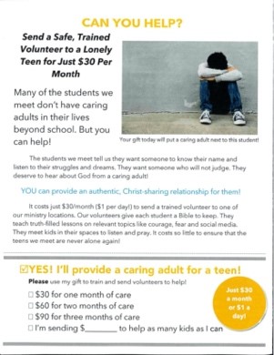
This cover…

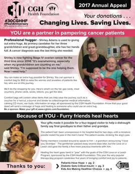
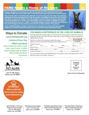
Not this cover…

That second cover has too much going on. I think there are six elements in the header alone. Too much copy. Seven different type treatments.

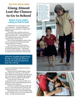
This interior page…

Not this interior page…

That second interior page has far too much copy. The one photo is too small. 

This back page…

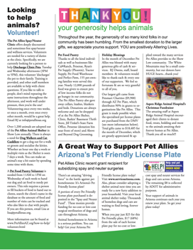
Not this back page…

The second back page has waaay too much “reverse text” (white text on a dark background) which is very hard to read for older donors. Plus it’s a self-mailer, which raises less money than newsletters that follow the format taught in these blog posts.

The lesson here: look at your newsletter from a few feet away. Does it look friendly?  Easy to read?  Or does it look thick with information and visually cluttered?

That’s Fine, But What Do I Do?

Here are the general newsletter rules we live by:

  • Not too much text
  • 13 point typeface or larger
  • Headlines, subheads and picture captions should always be in a high-contrast color (preferably black)
  • Use reverse text only when it’s a couple/few words in larger type
  • Black text on a white background is always the most readable
  • Don’t put your text in colors that are low contrast (they are harder to read for older donors). 
  • 2 or 3 text columns max

Know What’s Most Important

The trick is to know what’s most important.

If you’re judging your newsletter by asking, “Does it look nice and use our brand colors?” you’re asking the wrong question.

The first, most important question is, “Is it easy to read and convey our main message in a couple seconds?”

Nail that. Then add graphic elements and flourishes but keep the text readable. 

Because remember, it’s all about readability. If fewer people read your fundraising, fewer people give to your fundraising. So make your fundraising newsletter easy to read!

This post was originally published on July 23, 2020 in a series of 10 posts on Donor-Delighting Newsletters. This series has been published as an e-book that can be downloaded here.

Why Easier to Understand Wins Every Time in Direct Mail Copy

Confused.

When you’re writing fundraising copy, before you add a sentence, explain more, or tweak what you’ve already written… stop and ask this question.

Does this make it easier to understand or harder to understand?

It can be so tempting to complicate things. Explain the extenuating circumstances. Explore the nuances. Add something interesting but only loosely related.

But then you end up with something that is harder for your donors to understand.

As a professional fundraising copywriter, I ask myself this question all the time. It keeps me focused on what’s important to my reader, not just what’s important to me.

Here’s something you can try that might make it easier to write things for donors to read. Imagine you ARE your donor.

Do you ever wake up and think, “Hey, I’d like to read something really complicated today – where I have to read every sentence three times – and then I’m STILL wondering what’s happening?”

Probably not.

This is especially true if it’s something you don’t have to read.

When it comes to donors who are busy and moving fast, easier to understand wins out over harder to understand every time.

By the way, this also means easier to understand leads to more donations when you ask donors to give. Because donors must understand what you need before they’ll give.

Now we’re talking!

So next time you sit down to write fundraising copy, don’t forget this important question: does this make it easier to understand or harder to understand?

Bonus idea! Easier to understand vs. harder to understand is also important when you’re editing fundraising writing, planning a presentation, or communicating with donors in any way.

Give it a try and let me know how it goes.

Start on Common Ground

Brain fog.

If you would like your letters and emails to raise more money, they should begin by talking about something the donor already understands, as opposed to asking the donor to learn something new.

Here’s a made-up example of an appeal that starts by asking the donor to learn new things.

Did you know that 19% of the families in our community have no exposure to the Arts? We call them L.E.A.H.s (Lacking Arts Exposure Households) and a LEAH might be arts-curious, but never had an enjoyable introduction to the Arts that was relevant to their life.

Look at all the work the reader has to do:

  • Understand a statistic
  • Learn a new acronym
  • Learn a new phrase (“arts-curious”)

All that and they haven’t reached the second paragraph!

A Neuroscientist would say, “That paragraph puts a large cognitive load on the reader.” So do you think the reader is more likely to keep reading, or less likely to keep reading, after a paragraph like that?

Now, here’s an alternative approach to the first paragraph, one that begins with what the donor already knows…

A lot of families in our community don’t have the same relationship with the Arts that you and I do. And I know you’d love for everyone to experience the same fulfillment and joy that you feel. But too many people were never introduced to the Arts in a way that was relevant to their life.

In addition to sounding more personal and less like a teacher, that paragraph opens by talking about things the donor already understands and cares about.

A paragraph that speaks to the common ground the organization shares with the donor will create connection with the donor.

The donor is now more likely to keep reading. Which means the donor is now more likely to donate.

Is there ever time for a statistic or bit of education? Sure. But most likely at an event or in some other context (lunch with a major donor, blog post) where both you and the donor have more time.

In a context like the mail or email where donors are moving fast (when was the last time you read a fundraising email top to bottom on your phone?) start with something the donor already knows. Not an education barrier.

Create things your donors can READ

read

The other night I went to a new pizza place with my parents.

As we walked up to the restaurant, I began to think the place might be a little too… hip… for us.

We got seated at a booth in a dark dining room and we each were handed our own tiny menu.

I looked at the menu and… I couldn’t read it! I moved it closer to my face, then further away. I squinted. Not much help.

9-point font, maybe even 8-point. Muted red text. Dark cream-colored paper.

Did I mention the room was dark?

Ugh.

As I looked around the room, I began to wonder. Do they not want us here?

Here’s the thing. This what happens to your donors all the time! At a pizza place. In the grocery store. And sometimes when they open your fundraising letter.

They can’t read it.

The thing is, I’m not THAT old. I’m about 25 years younger than your average US donor.

And I won’t go back to that pizza place again.

Do you want your donors to feel like that? I imagine not!

The most fundamental thing you can do to honor your donor and let them know they matter is to send them stuff they can read. WITHOUT squinting.

This is an EASY thing to do. But so many organizations ignore this easy thing due to brand guidelines or the blissful ignorance of being under 40 years old when you can still read everything with no problem!

Here’s where you can start to create communications your donor can actually READ:

  • Black text (not a hip shade of charcoal – black!)
  • White background (no graphics behind the text)
  • 14-point font (absolutely no smaller than 12-point!)

Done.

The stakes are high here.

If your donor can’t read your materials, she is less likely to send in a gift. And if she doesn’t send in a gift, that affects your ability to carry out your mission.

So take it seriously!

Your donors will thank you.

Sarah

Print Newsletter Design: Readable and Scannable Above All Else

Newsletter design.

For the smaller nonprofits out there, who don’t have super-pro Designers creating their newsletters, do not worry.

Your newsletter does not need to have fancy or complicated design to be successful.

In fact, fancy and complicated design usually lowers readability – which lowers the effectiveness of your newsletter.

What you’re going for is “clean and easy to read.”

Here are a bunch of examples – kept purposefully small. You will be able to tell at a glance which ones are readable… and which aren’t. 

This, Not That

This cover…

Not this cover…

That second cover has too much going on. I think there are six elements in the header alone. Too much copy. Seven different type treatments.

This interior page…

Not this interior page…

That second interior page has far too much copy. The one photo is too small. 

This back page…

Not this back page…

The second back page has waaay too much “reverse text” (white text on a dark background) which is very hard to read for older donors. Plus it’s a self-mailer, which raises less money than newsletters that follow the format taught in these blog posts.

The lesson here: look at your newsletter from a few feet away. Does it look friendly?  Easy to read?  Or does it look thick with information and visually cluttered?

That’s Fine, But What Do I Do?

Here are the general newsletter rules we live by:

  • Not too much text
  • 13 point typeface or larger
  • Headlines, subheads and picture captions should always be in a high-contrast color (preferably black)
  • Use reverse text only when it’s a couple/few words in larger type
  • Black text on a white background is always the most readable
  • Don’t put your text in colors that are low contrast (they are harder to read for older donors). 
  • 2 or 3 text columns max

Know What’s Most Important

The trick is to know what’s most important.

If you’re judging your newsletter by asking, “Does it look nice and use our brand colors?” you’re asking the wrong question.

The first, most important question is, “Is it easy to read and convey our main message in a couple seconds?”

Nail that. Then add graphic elements and flourishes but keep the text readable. 

Because remember, it’s all about readability. If fewer people read your fundraising, fewer people give to your fundraising. So make your fundraising newsletter easy to read!

This post was originally published on July 23, 2020. Get a free downloadable “e-book” of this whole series here.

Newsletter Design: Readable and Scannable Above All Else

Newsletter design.

For the smaller nonprofits out there, who don’t have super-pro Designers creating their newsletters, do not worry.

Your newsletter does not need to have fancy or complicated design to be successful.

In fact, fancy and complicated design usually lowers readability – which lowers the effectiveness of your newsletter.

What you’re going for is “clean and easy to read.”

Here are a bunch of examples – kept purposefully small.  You will be able to tell at a glance which ones are readable… and which aren’t. 

This, Not That

This cover…

Not this cover…

That second cover has too much going on.  I think there are six elements in the header alone.  Too much copy.  Seven different type treatments.

This interior page…

Not this interior page…

That second interior page has far too much copy.  The one photo is too small. 

This back page…

Not this back page…

The second back page has waaay too much “reverse text” (white text on a dark background) which is very hard to read for older donors.  Plus it’s a self-mailer, which raises less money than newsletters that follow the format taught in these blog posts.

The lesson here; look at your newsletter from a few feet away.  Does it look friendly?  Easy to read?  Or does it look thick with information and visually cluttered?

That’s Fine, But What Do I Do?

Here are the general newsletter rules we live by:

  • Not too much text
  • 13 point typeface or larger
  • Headlines, subheads and picture captions should always be in a high-contrast color (preferably black)
  • Use reverse text only when it’s a couple/few words in larger type
  • Black text on a white background is always the most readable
  • Don’t put your text in colors that are low contrast (they are harder to read for older donors). 
  • 2 or 3 text columns max

Know What’s Most Important

The trick is to know what’s most important.

If you’re judging your newsletter by asking, “Does it look nice and use our brand colors?” you’re asking the wrong question.

The first, most important question is, “Is it easy to read and convey our main message in a couple seconds?”

Nail that.  Then add graphic elements and flourishes but keep the text readable. 

Because remember, it’s all about readability.  If fewer people read your fundraising, fewer people give to your fundraising.  So make your fundraising newsletter easy to read!

Read the series:

This post was originally published on July 23, 2020.

Newsletter Design: Readable and Scannable Above All Else

Newsletter design.

For the smaller nonprofits out there, who don’t have super-pro Designers creating their newsletters, do not worry.

Your newsletter does not need to have fancy or complicated design to be successful.

In fact, fancy and complicated design usually lowers readability – which lowers the effectiveness of your newsletter.

What you’re going for is “clean and easy to read.”

Here are a bunch of examples – kept purposefully small.  You will be able to tell at a glance which ones are readable… and which aren’t. 

This, Not That

This cover…

Not this cover…

That second cover has too much going on.  I think there are six elements in the header alone.  Too much copy.  Seven different type treatments.

This interior page…

Not this interior page…

That second interior page has far too much copy.  The one photo is too small. 

This back page…

Not this back page…

The second back page has waaay too much “reverse text” (white text on a dark background) which is very hard to read for older donors.  Plus it’s a self-mailer, which raises less money than newsletters that follow the format taught in these blog posts.

The lesson here; look at your newsletter from a few feet away.  Does it look friendly?  Easy to read?  Or does it look thick with information and visually cluttered?

That’s Fine, But What Do I Do?

Here are the general newsletter rules we live by:

  • Not too much text
  • 13 point typeface or larger
  • Headlines, subheads and picture captions should always be in a high-contrast color (preferably black)
  • Use reverse text only when it’s a couple/few words in larger type
  • Black text on a white background is always the most readable
  • Don’t put your text in colors that are low contrast (they are harder to read for older donors). 
  • 2 or 3 text columns max

Know What’s Most Important

The trick is to know what’s most important.

If you’re judging your newsletter by asking, “Does it look nice and use our brand colors?” you’re asking the wrong question.

The first, most important question is, “Is it easy to read and convey our main message in a couple seconds?”

Nail that.  Then add graphic elements and flourishes but keep the text readable. 

Because remember, it’s all about readability.  If fewer people read your fundraising, fewer people give to your fundraising.  So make your fundraising newsletter easy to read!


Read the series: